
As part of our next upgrade cycle, Powerbase is getting a face-lift!
Powerbase has had the same look and feel for its entire 10 year history. The design is based on Internet design principles dating back to the days of AOL: make web sites look like an office, with tabs, and folders and shading that make buttons seem like they are three dimensional.
Over the last 10 years there has been a revolution in design based on making web sites easier to use. Most web sites have done away with the old principles, and focus on making buttons and tabs easy to identify and to ensure that the screen space is used in the most efficient way possible.
These new principles were used in the new design you will see after your site is upgraded in March, 2020.
Here's the link to the recording of the "Powerbase Got a Brand New Look" webinar on February 28, 2020.
What should I expect after the upgrade?
Most of the new design is about "look and feel" - not about navigation or what buttons you click to get your work done. For that reason, while the new design will definitely catch your eye, we don't expect it to interrupt your work.
However, there are a few exceptions and we will review those below.
Because of these exceptions, and to be absolutely sure we don't interrupt your work, we are only partially enabling the new look and feel as part of the upgrade.
However, once you learn the basics, we are confident that everyone will want the full new look and feel.
What's different?
Here's a quick series of screen shots to show you what we mean.
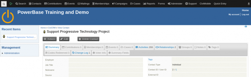
First... the old tired but true look of Powerbase:
After we upgrade, things will look a lot different:
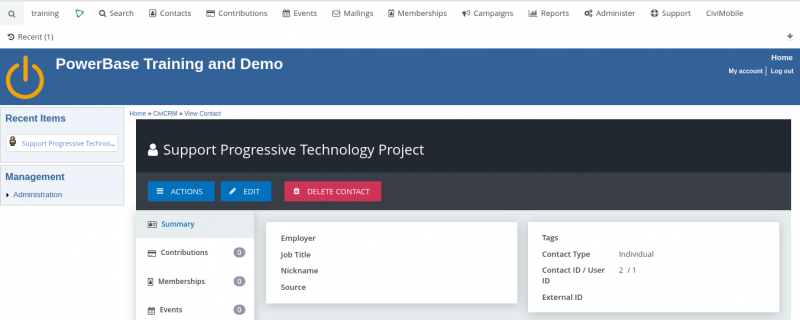
In addition to the new colors, note that the previous tabs (Summary, Contributions, Membership, etc.) ran horizontally along the top. Now the contact tabs run vertically along the left hand side.
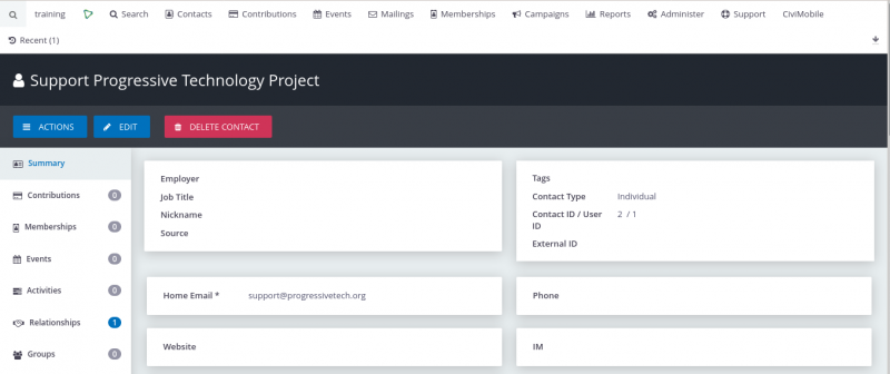
But... things really shine when you go all in:
Wait, what just happened?
Powerbase has always been framed by a header and left sidebar. These elements have always matched, like an old sweat suit. But now, the Powerbase part just got some shiny new threads.
When we initially upgrade your site, you are going to get the shiny Powerbase framed by the old sweaty header and sidebar.
For those of us that are comforted by the header and sidebar and our ability to navigate using the links that live there, you will still be able to get around. Phew!
However, the designers of the new look and feel recognized something important: the header and sidebar take up a lot of space on the screen and don't really contribute that much back. That's why the new design really wants to take over everything.
But... how do I get around in the new design?
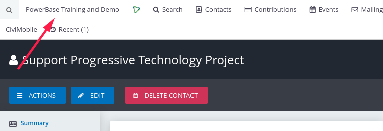
Before you clicked on your organization's name in the header to get to the dashboard.
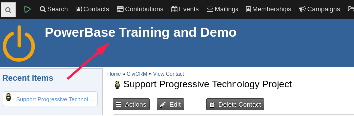
And you still do that! In the new version, the name of your site is smaller and moved a bit:
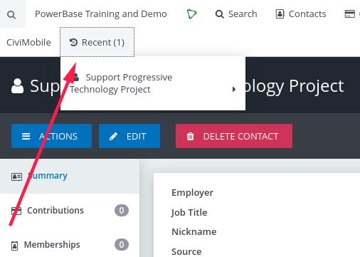
Before you found your recent items in the left sidebar
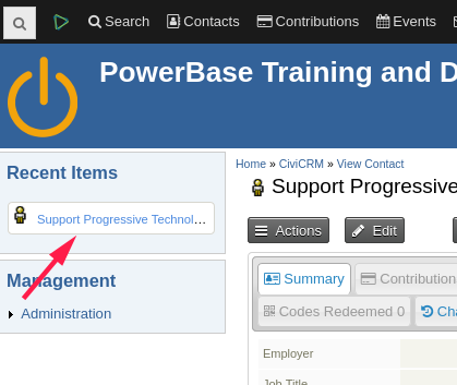
Now, they are in the menu bar:
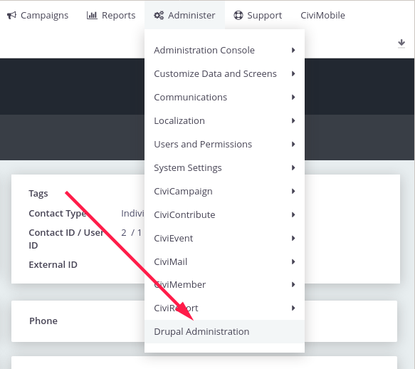
Before you accessed the Drupal administration area via the sidebar:
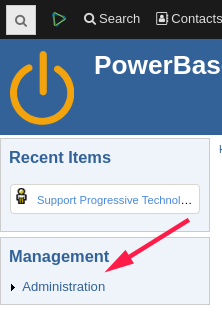
Now, you do that through the menu system:
But wait... what about my custom x-y-z thingy in the sidebar?
If your organization uses the sidebar for something specific (like a set of quick links) just let us know. We are happy to re-create them via the top menu so you too can benefit from the full design!